


![[LibDems]](http://www.titanictown.plus.com/hp/LibDem.png)
![[Lead]](http://www.titanictown.plus.com/hp/lead.png)
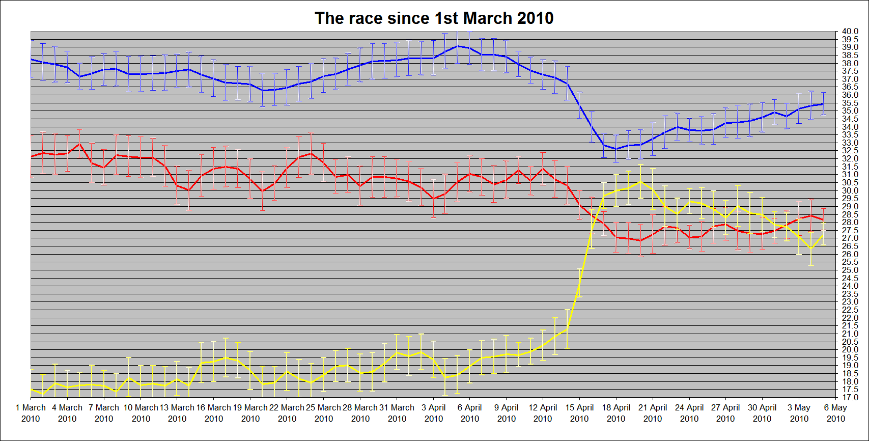
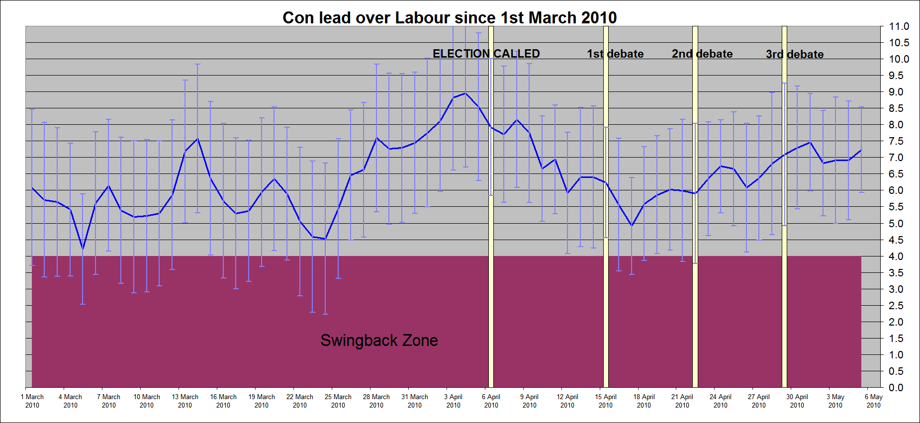
These new graphs go back to 1st of March, and show the Labour and Conservative shares, together with the all-important lead. Error bars are also shown, indicating the 95% confidence intervals.
We can see that the lead was narrowest on the 5th March and 24th March, and highest on the 4th April. Since then, the lead appears to have narrowed...
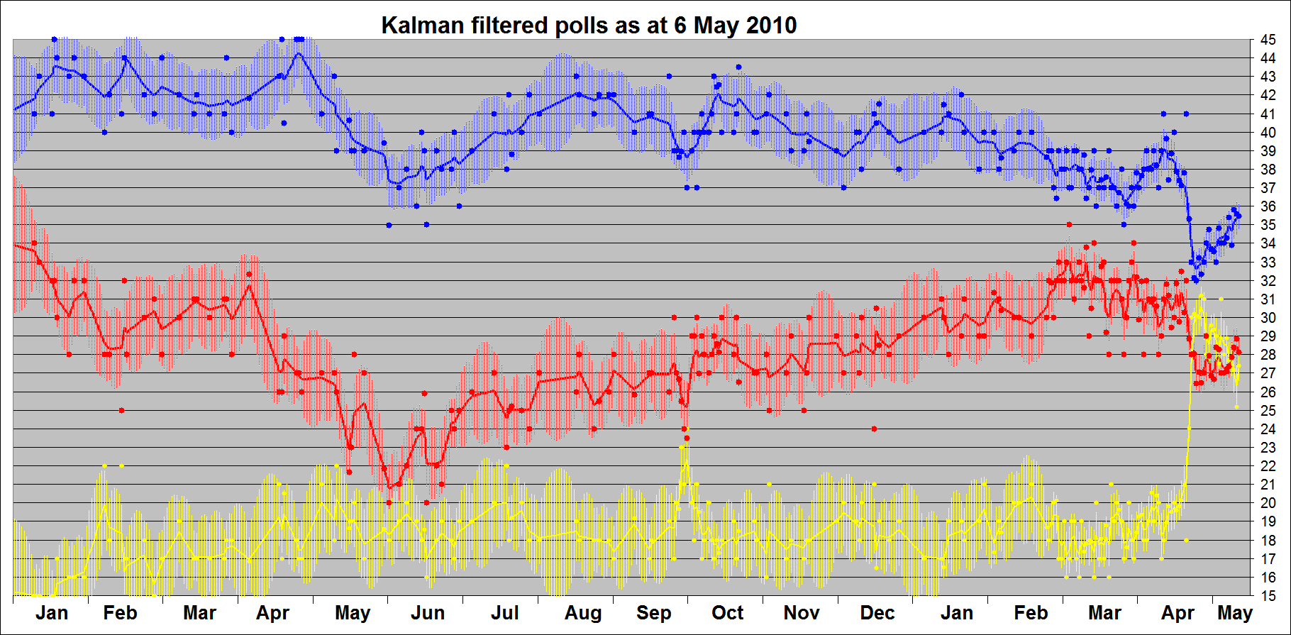
The yo-yo effect on the Labour estimate is due to the wide variation in different pollsters' estimates, particularly as Harris and Opinium enter and exit the field. The pollsters are far more uniform in their estimates of the Tories' share.
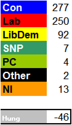
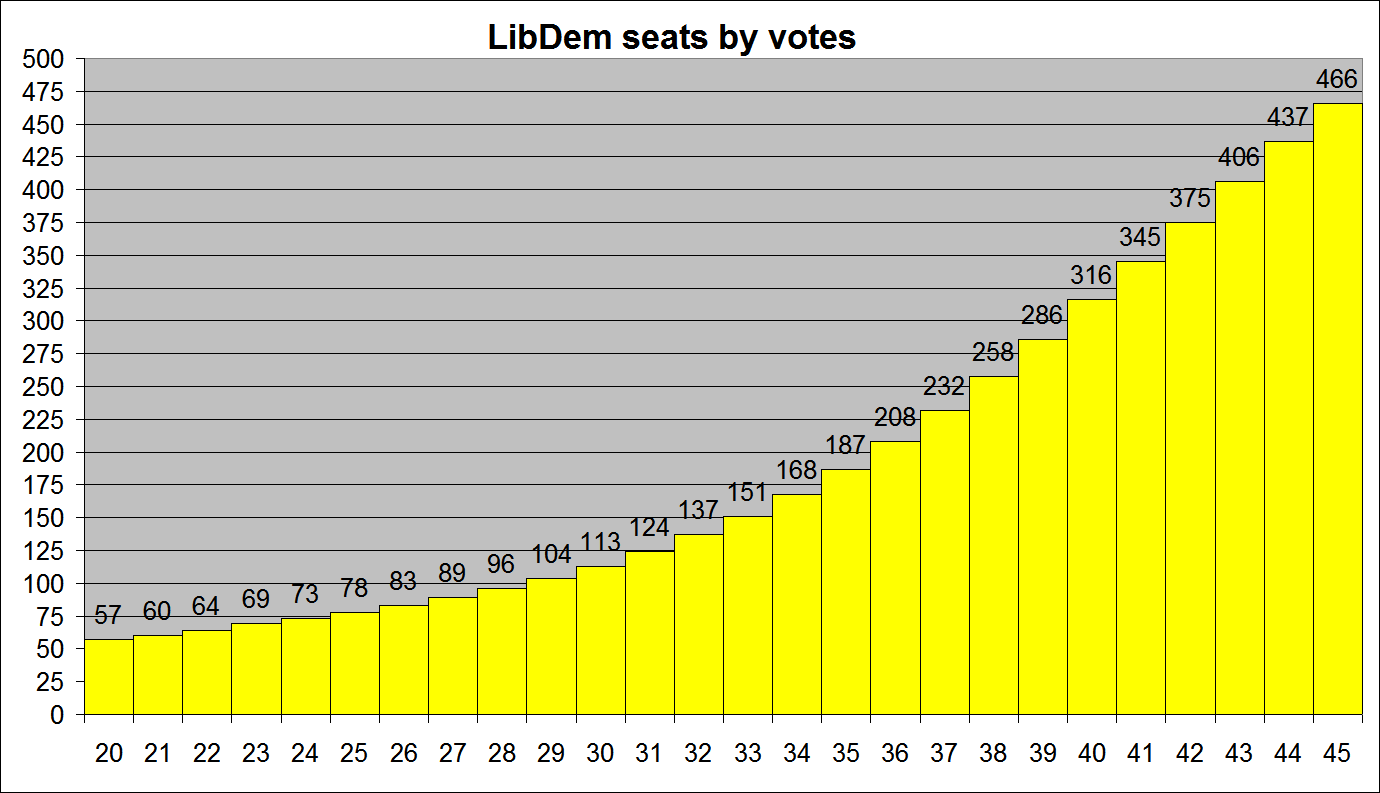 Update: all three parties are now displayed on the same graph. At right there's an image illustrating how many seats the LibDems might win for various shares of the vote. It assumes whatever the LD vote share the Tories maintain a roughly five point lead over Labour.
Update: all three parties are now displayed on the same graph. At right there's an image illustrating how many seats the LibDems might win for various shares of the vote. It assumes whatever the LD vote share the Tories maintain a roughly five point lead over Labour.![Reblog this post [with Zemanta]](http://img.zemanta.com/reblog_e.png?x-id=8cf0911a-2fe2-40b5-a335-5056e0dff05c)